TireCheck
Website Strategy / UI+UX / Development / Content Population
Masters of their craft, TireCheck are experts in tire pressure monitoring systems (TPMS) that reduce fleet downtime, improve data monitoring, and increase sustainability across the vehicle and tire industry. But their digital presence had fallen behind and wasn’t reflective of their reputation in the industry.
Project team
Brand strategy + account management: Shane Moran
Brand strategy + art direction: Bloody Lovely Branding Co.
Website strategy, web design + development: Background
Strategy + Discovery
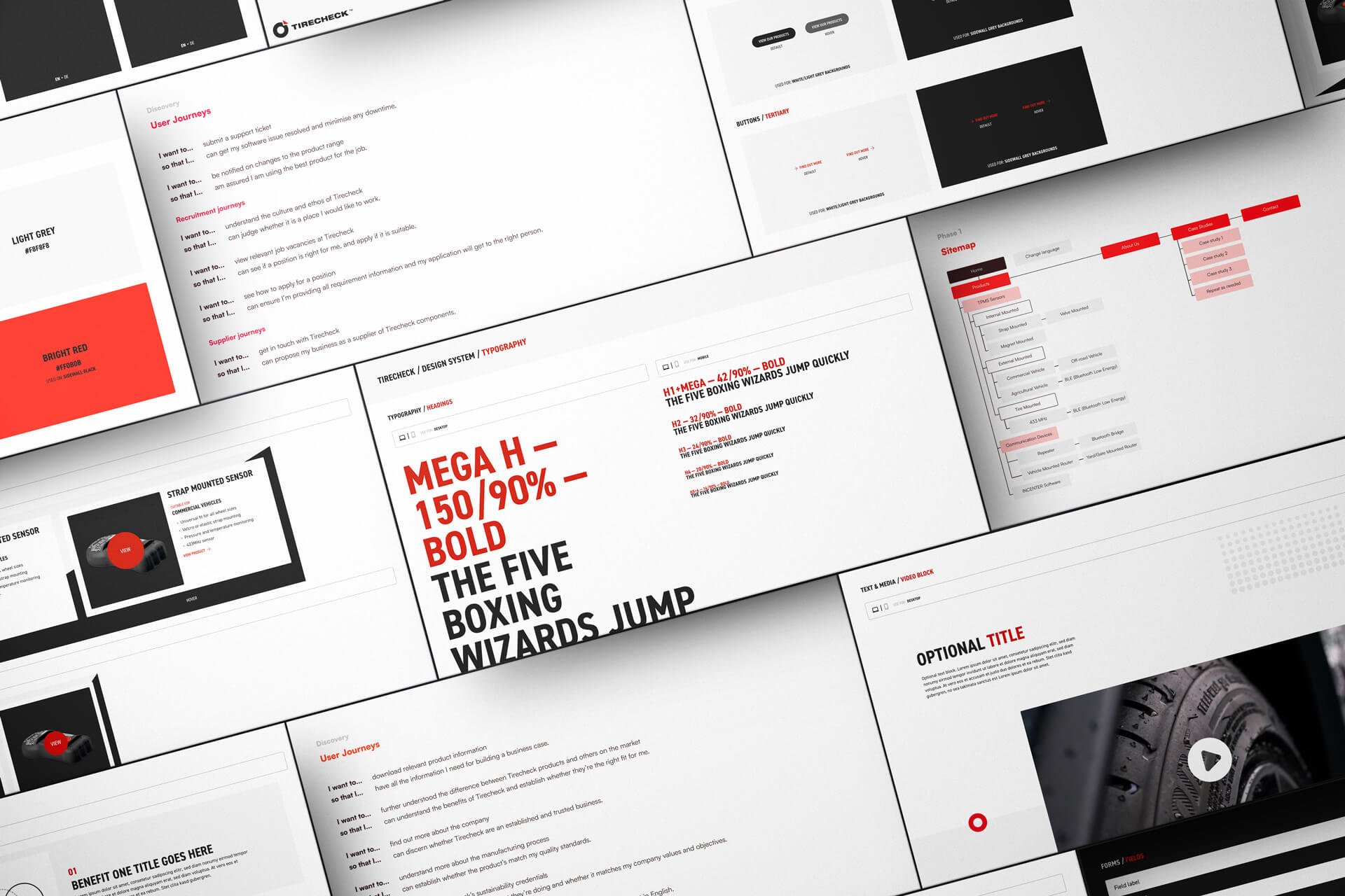
We developed a new website strategy through user journeys, sitemap optimisation, content structures and a clear phased roadmap for future developments. Backed by an all new visual style and component-led development approach that brings a modern, innovative look to match their products and services.
The little touches that make a difference
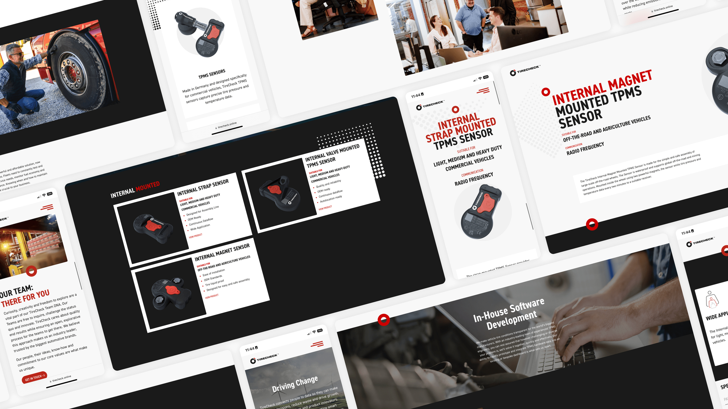
With TPMS products it’s all about the details, saving that little bit of weight, or an increase in data accuracy. And we took that same attention to detail to the website. Designing and building a component-based system that combines custom iconography, industry relevant imagery, and bespoke renders to guide users through the journey, ensuring they have all the engineering information they need, as well as wider context about TireCheck as a supplier.
Clear and simple signposting
We optimised the sitemap, to ensure users could find the information they were looking for at all stages of their journey. From initial product exploration, to detailed specifications and downloadable product specs. The content gets more detailed the deeper they go, and includes signposts to their support platform and resources. Creating a one-stop shop whether you’re a prospective or existing customer.


