MyKeyInfo
UI/UX
MyKeyInfo was born out of frustration. If you’ve ever needed to find an important document or policy number only for your welcome letter to have gone walkabout then you’ve shared that frustration. Enter MyKeyInfo, an AI-driven service to help you stay on top of all your providers, policies, and dates.
An MVP Approach
With an expansive feature roadmap on the cards and a minimum viable product (MVP) identified, it was essential that a robust design system was introduced so the app could scale over the next couple of years without the need for time consuming redesigns.
Smooth Onboarding
System in hand, attention turned to onboarding. We designed a setup wizard that would allow a user to create an account, input their vehicle’s registration number, and before they could say “where did I leave my insurance certificate” the AI has found when the tax and MOT are due. But it doesn’t end there, it’s also set you and your vehicle up in the system, ready to send you email alerts so you don’t get into hot water.
“We were looking for advice on aspects of app design, web design, and associated storytelling. In the process, Nick absorbed the occasional changes of opinion and direction with flexibility and patience, whilst keeping us on the straight and narrow. We greatly appreciated his experience, as well as his pragmatic approach to getting things done, with many of his ideas now incorporated in our App and in our sites.”
Mark Schmidt
Director & Co-Founder, MyKeyInfo


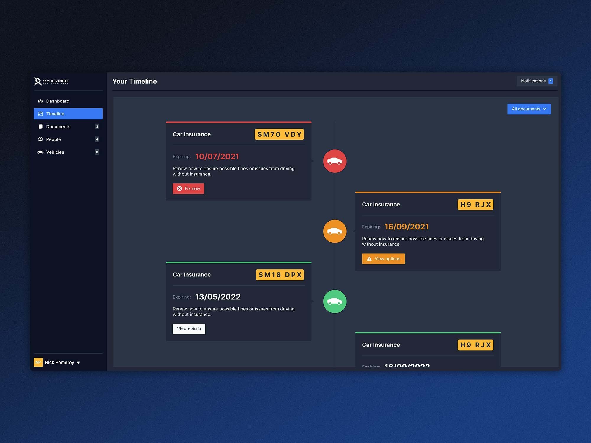
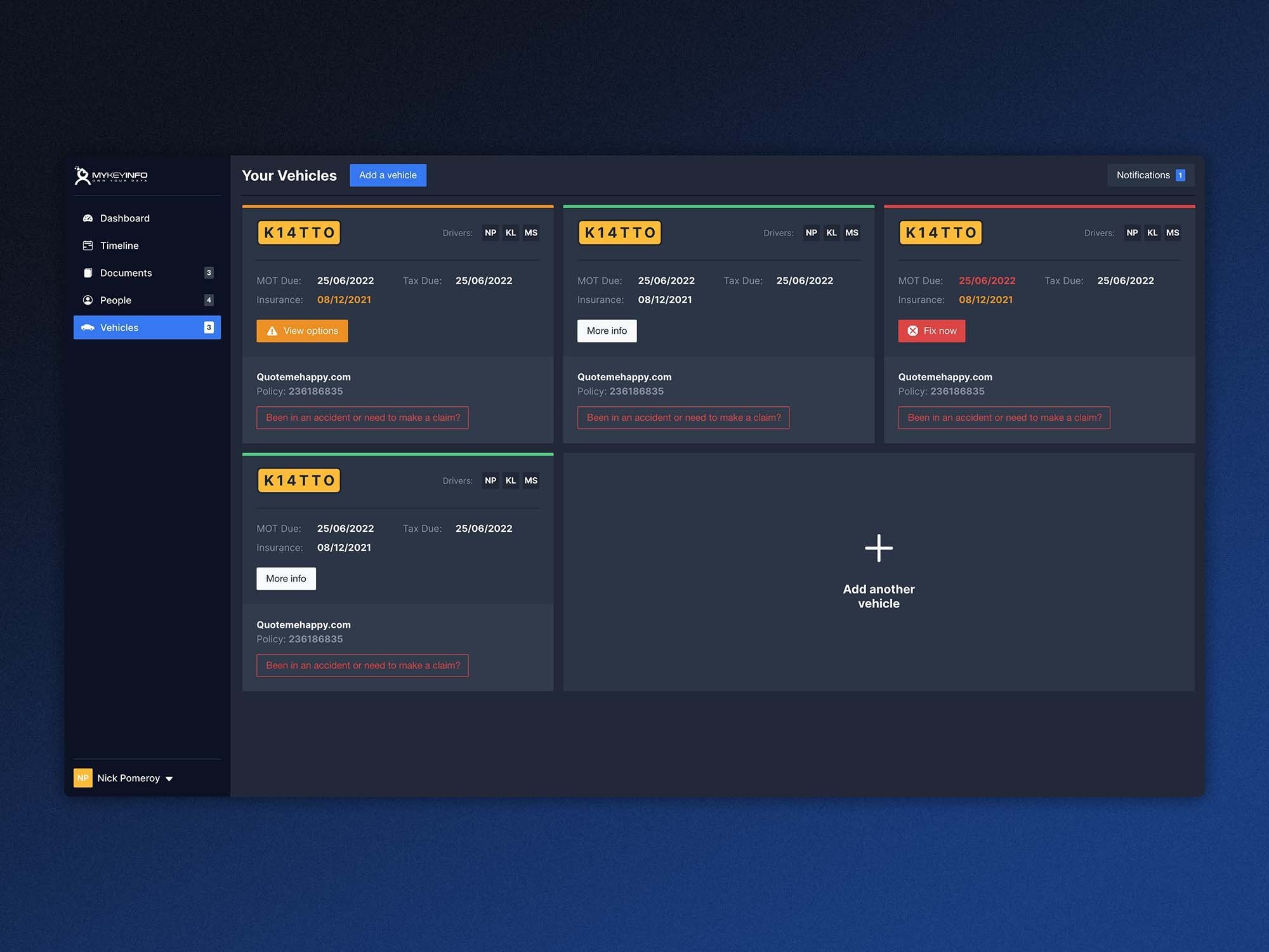
And to top it off, we’ve designed document views with key info highlighted, colour coding throughout the app to gauge severity at a glance, and an automated timeline that means you’re never in doubt about next steps and expiry dates.


