Ethics in UX
In many aspects of business, the question of ethics has been a long debated issue that continues to cause friction. But you rarely see those same questions and conversations applied to user experience design (UX).
The Rise of Analytics and Dark Patterns
As analytics rose to prominence and became more pervasive, so did unethical UX practices designed to trick, obfuscate information, or simply lie to users.
Some of these are well known like opt-in or opt-out checkboxes for marketing communication which are, despite regulations including GDPR, often written in a confusing manner that is solely aimed at getting people’s ‘consent’. While some are more obscure, like Confirmshaming which aims to guilt users to take an action they otherwise wouldn’t want to e.g. a ’No, I don’t want this awesome deal’ button when you’re trying to close a sales pop-up that appeared unannounced.
It’s the Internet, isn’t it All Fair Game?
There’s one school of thought that it’s all fair game in the digital space. But with growing privacy concerns, the prevalence of digital scams, and an increasingly discerning customer base who are fed up of being taken for fools, it’s easy to see why employing unethical UX practices in your digital products can quickly see your reputation take a downturn. But in the name of increasing sales and with digital products having less accountability than their physical counterparts, companies often feel it’s ok to use duplicitous strategies.
A Fine Line
I have faith that the majority of unethical UX decisions aren’t made to be unethical. They’re made as a direct response to a datapoint and trying to increase conversion rates, click throughs, or enquiries. And in some instances it’s a fine line between unethical design, and just good old fashioned information hierarchy.
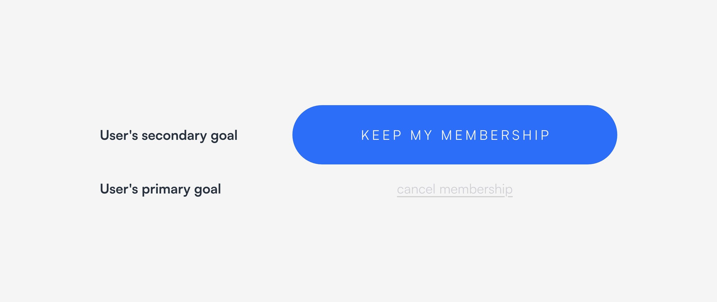
Take the example below for instance, is this unethical or just a logical way to display information in an order and size hierarchy that follows the expected user journey. It makes sense that the secondary action would be less prominent right?
But when that same principle gets applied to another circumstance where the objectives of the user and business aren’t aligned, it introduces an unethical situation.
Can you see the problem? Just because you as a business don’t like the decision a user is making, doesn’t mean you have the right to make it unreasonably difficult to complete an action.
When it Really Goes Wrong
Luckily a lot of these practices are unethical in the sense that they make our lives online more frustrating and that’s the end of it. But in some cases they can have serious consequences.
If you search any news site for stories of children spending thousands of pounds on in-app purchases without realising, you’ll find hundreds of articles and yet the UX practices and design decisions that cause these are still prevalent in apps today.
You could argue that there’s a responsibility on the user (or parent of the user in this case), and you’d be right. But don’t we as designers or business owners also have a responsibility to create products that solve our users issues and are appropriate for our target audience?
So in the example of purchases in apps targeting children, there could be a simple solution of adding a confirmation screen before any purchases get made saying that this is in fact real money, and to ask a parent or guardian before going ahead. Or having a system that allows a guardian to hide in-app purchases from their child’s account while still allowing the guardian to buy them if they choose to do so.
There would still be a requirement for the parent to be active in the conversation, but the child is being educated rather than preyed upon in a situation that can have serious consequences. A simple change that could reduce revenue, but a more ethical one that also avoids bad press.
Other Examples
Hidden Costs
Hidden fees are a way to obfuscate the true price of an item and get a user far enough down the checkout process before adding additional costs in the hope that they’ve committed to the purchase and will accept the price increase, and often it works. But it also serves to frustrate users and put them off shopping with you again if those costs are prohibitive enough. So when it comes to the checkout area of an e-commerce site, signpost delivery fees, ticket fees, etc upfront and do your users a favour.
Misleading Content
I’m in the market for a bath at the moment but timings are tight, and we need to make sure everything is ready to go once the builders start their work. So we found a bath and the website advised 4-6 days for delivery — fitting our timelines perfectly. But when the order confirmation email came through it said there was an 8-10 week lead time before we’d even get to the 4-6 days for delivery. I checked their delivery and product pages again, no mention of that as far as the eye could see. Order cancelled and refunded. And they lost a customer, and wasted my time and theirs.
Trade-Offs Everywhere
It’s no longer good enough to follow the data and create a solution that’s in the interest of the business and the business alone. We have a duty to make decisions that achieve the business goals and do so in a way that considers the user needs and desires as well.
It’s a balancing act and there will always be trade-offs, but I guarantee frustrating your customers is one of the fastest ways to make sure they never shop with you again.
That’s why we’re advocates for ethical UX practices and believe it’s an extension of doing good — for business and people.
If you’re interested in becoming more ethical with your website or digital product, get in touch and find out more.


